Waggel / Case study
3 min read
Basket Redesign.
Redesigning a critical insurance purchasing journey to reduce friction, improve customer understanding and increase conversion.
- Role
- Project Lead / Product Design
- Focus
- Conversion Optimisation / UX Research / Product Design
- Product
- Pet insurance quote and purchase journey


01 / The problem
Customers were making it to the basket. Too many weren't making it through.
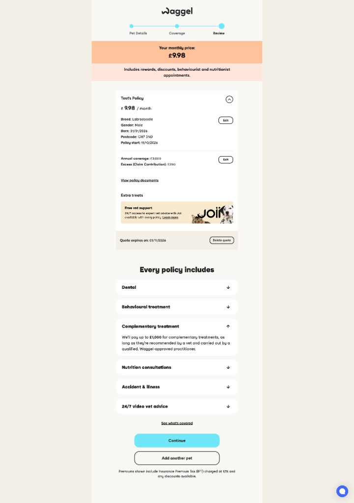
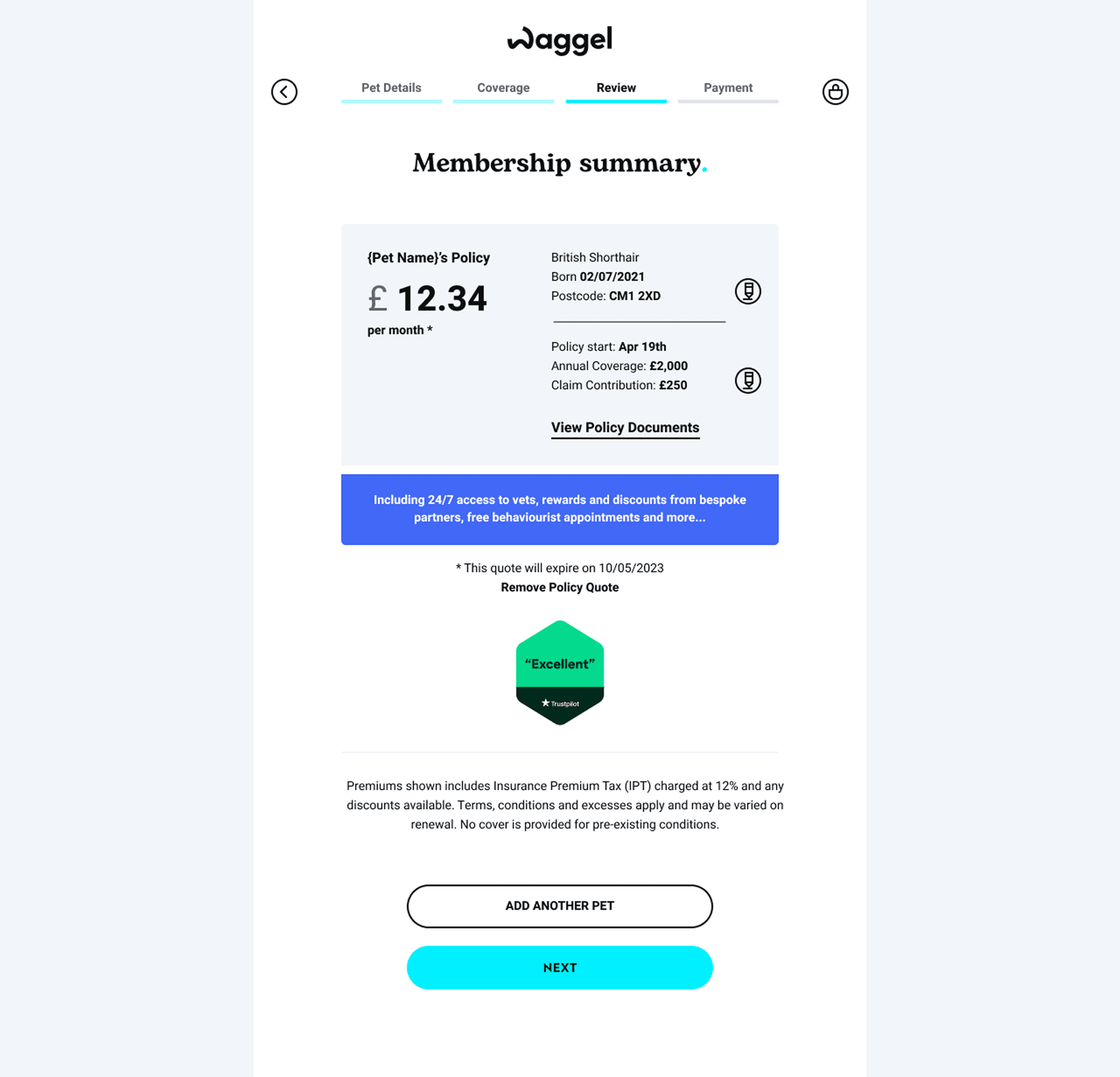
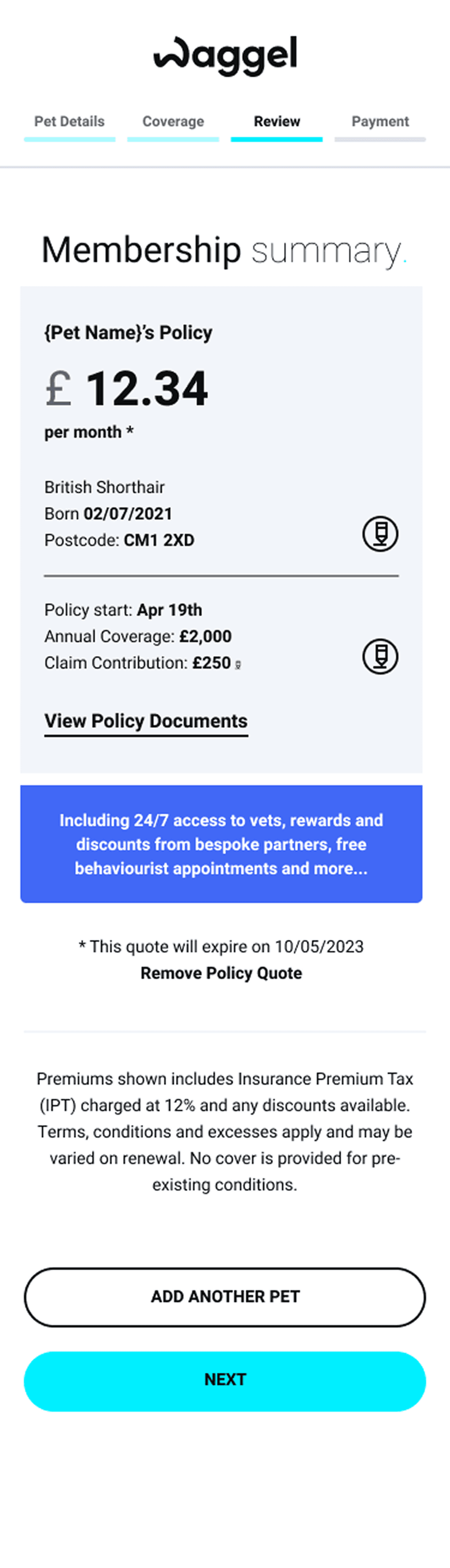
The basket is one of the most important stages of Waggel's insurance purchasing journey. Customers reach it after providing their pet's details and receiving a quote, but the experience wasn't giving everyone the clarity or control they needed to confidently complete their purchase.
Comparison-site customers accounted for over 60% of Waggel's revenue, making their experience particularly important. These customers often entered the basket with different expectations from those quoting directly.
The opportunity was to make the basket easier to understand, easier to edit and more effective at helping customers complete their purchase.
02 / Discovery
The data showed where people struggled.
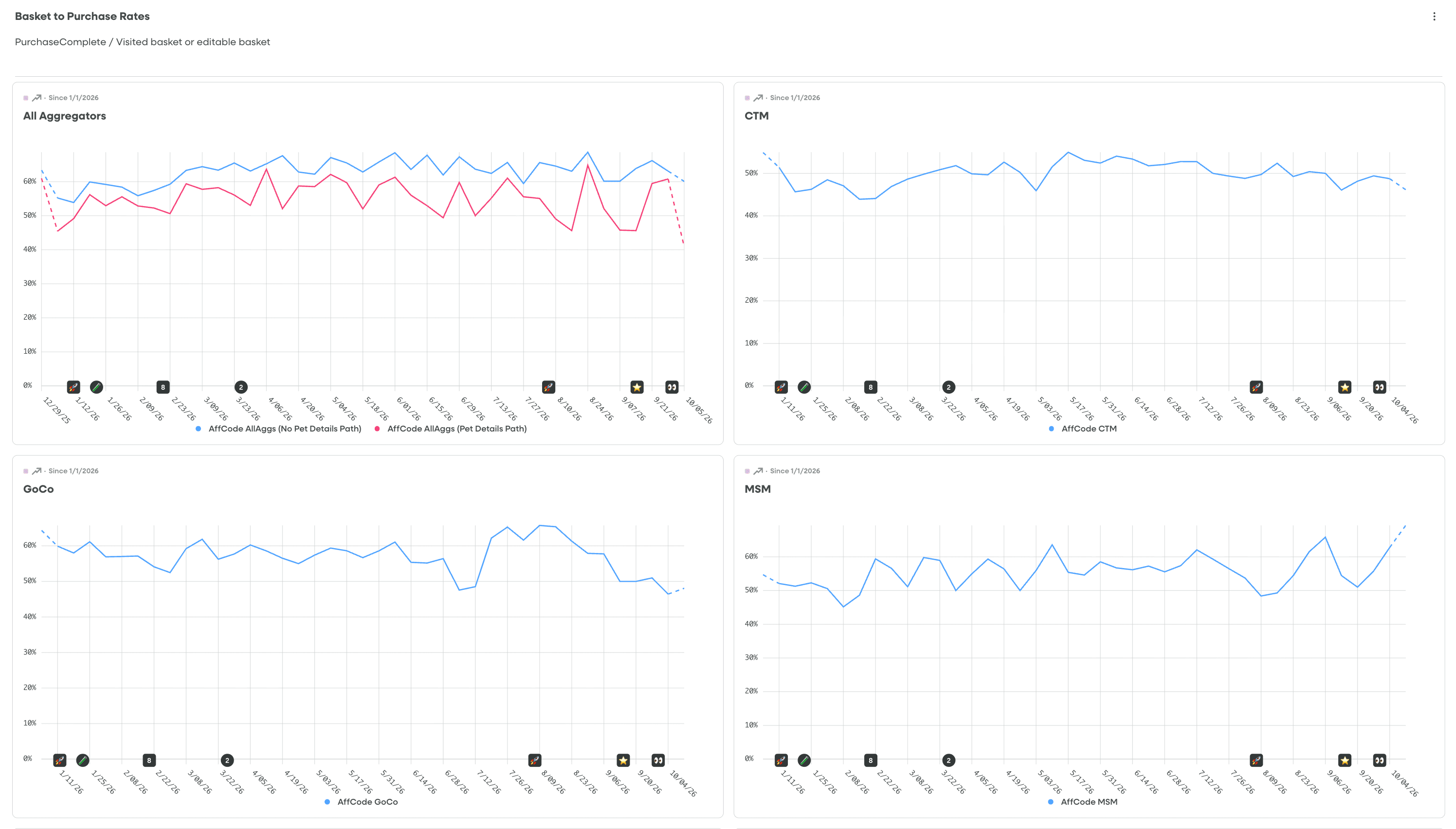
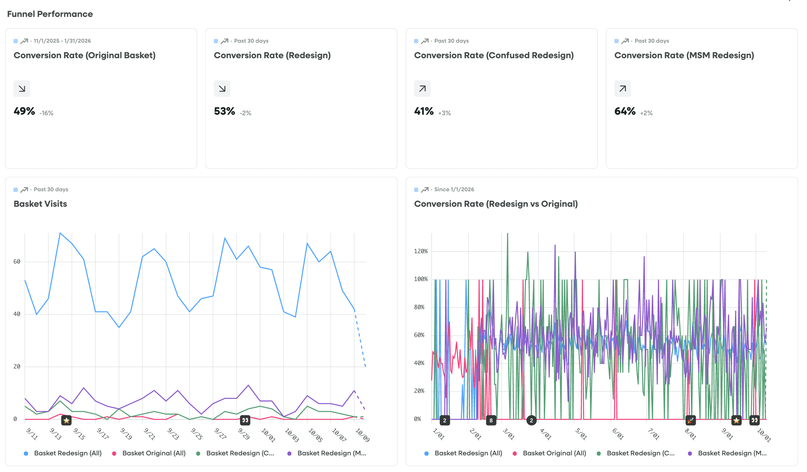
Rather than starting with a visual redesign, I investigated how customers were actually using the existing basket. I reviewed behavioural analytics and FullStory recordings to understand where people hesitated, what they interacted with and which actions interrupted the purchase journey.
This highlighted opportunities to make the experience clearer, particularly for comparison-site customers reviewing or changing their quote.
01
Customers were leaving to make changes
A significant number of customers returned to earlier quote stages rather than making straightforward changes within the basket.02
Important actions weren't always visible
The existing information hierarchy made it easier for users to overlook the primary purchase action, especially within a longer purchasing page.03
Customers needed clearer cover information
Customers needed an easier way to understand what they were buying and why particular cover options or benefits mattered.
03 / The strategy
Less friction. More confidence.
The opportunity wasn't simply to make the basket look better. It was to help customers understand their insurance, make changes without unnecessary repetition and reach the next step with greater confidence.
I focused the redesign on three principles that could improve the experience without requiring customers to relearn the purchasing journey.
01
Make edits effortless
Allow customers to update relevant quote details without repeatedly returning to earlier stages.02
Make cover understandable
Explain policy benefits and coverage more clearly at the point of purchase.03
Make the next step obvious
Give the purchase action greater prominence throughout the experience.
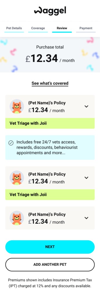
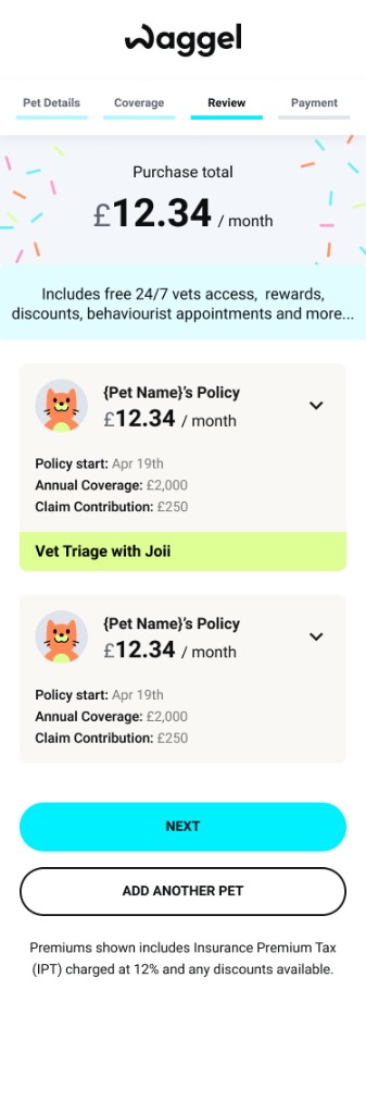
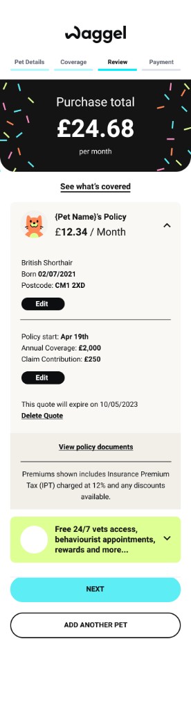
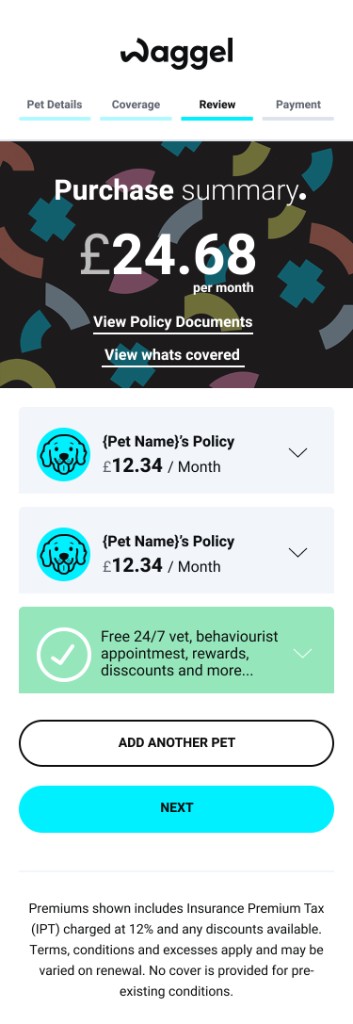
Figma explorations demonstrating how the basket layout, information hierarchy and edit interactions were explored before the final design.
04 / The experience
Making every decision easier.
01
Edit without starting again
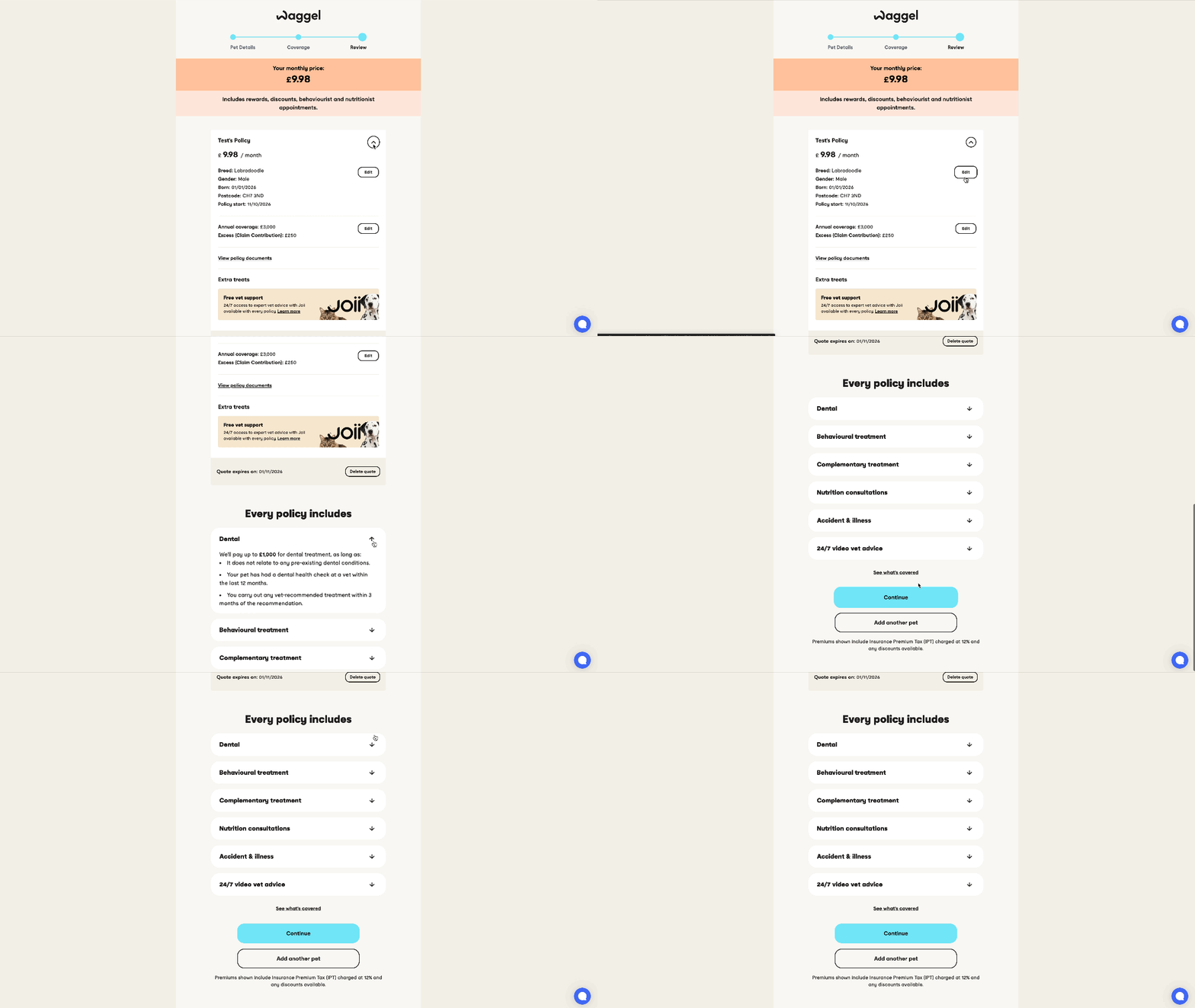
I introduced inline editing to make changing key quote details more straightforward. Rather than forcing customers back through earlier parts of the journey, the redesigned basket gives them greater control over their information at the point of purchase.
Change the details, not the entire journey.
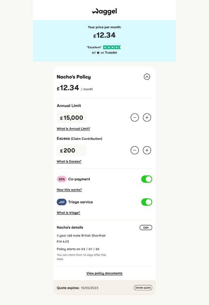
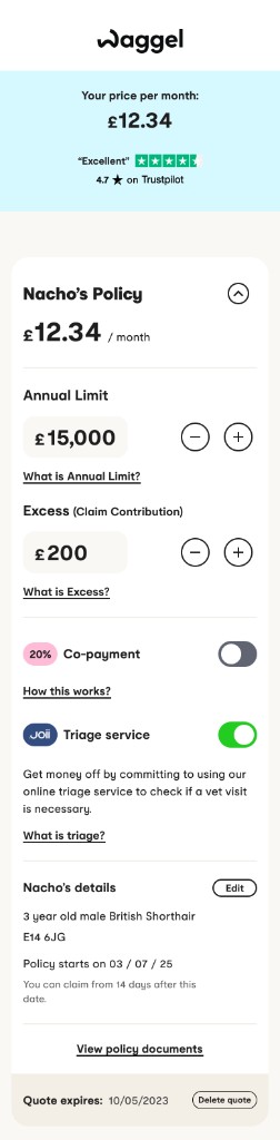
Concept design for inline editing, showing how quote details could be changed in the basket.
02
Make coverage clearer
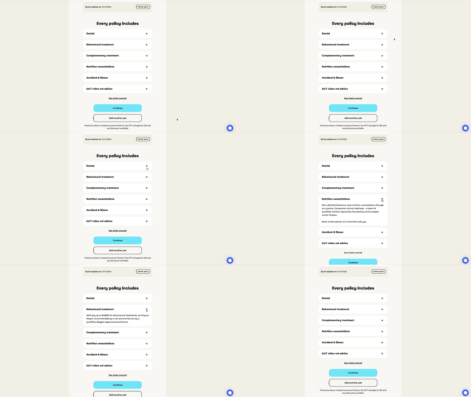
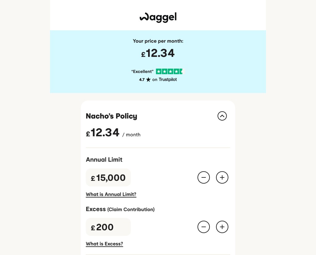
Insurance products can be difficult to compare when essential details are hidden behind unfamiliar terminology. I introduced clearer cover information and a more accessible 'What's covered' experience to help customers understand their policy before buying.
Help customers understand what they're paying for.
03
Clarify the aggregator journey
Comparison-site customers arrive with expectations shaped by the price and cover information they've already reviewed. The redesign considered this different entry point, reducing unnecessary uncertainty and making it easier to continue towards purchase.
Related quote-flow work, such as loading feedback, sat alongside this basket redesign rather than being treated as the same release.
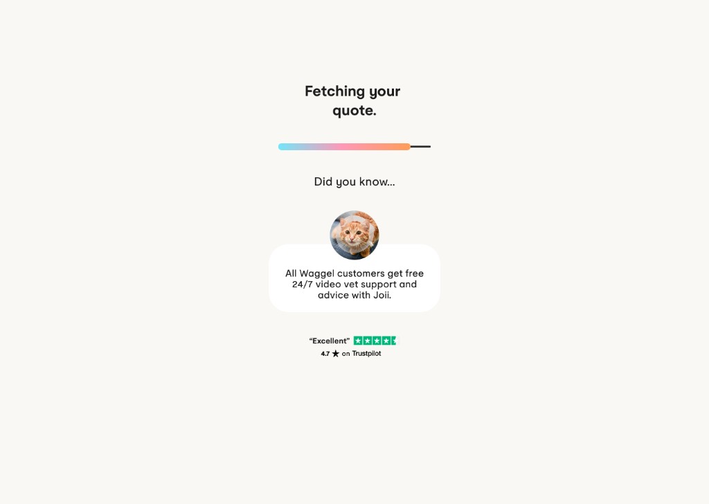
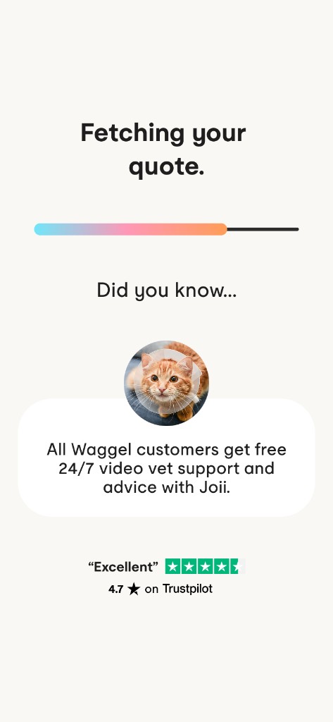
Loading experience for aggregator customers, informing them of facts about Waggel and the Trustpilot score.
05 / Delivery
Improving the journey without rebuilding everything.
The redesign had to balance customer improvements with technical delivery constraints. The work was approached in stages, allowing the team to deliver front-end experience improvements while more substantial backend changes could be considered separately.
That approach helped prioritise changes with clear customer value without making the initial release dependent on a complete rebuild of the purchasing journey.
- V1
Front-end experience improvements.
- V2
Backend-dependent improvements, considered separately.
06 / The impact
A clearer journey. Better results.
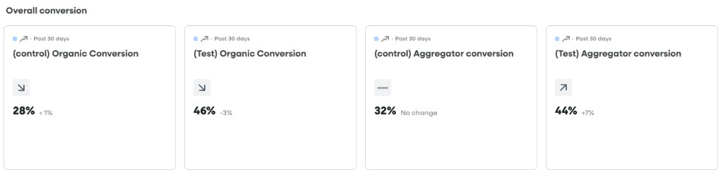
+18%
Organic conversion
+12%
Aggregator conversion
40%
Fewer coverage-related support enquiries
30%+
Improvement in quote retention
The basket redesign addressed measurable friction at a commercially important point in the purchasing journey. Improvements to editing, information clarity and purchase-action visibility helped create a more effective experience for customers reviewing their insurance quotes.
07 / Looking back
Better design starts with better questions.
This project reinforced the value of understanding behaviour before jumping into solutions. What initially looked like an opportunity to improve a single page revealed wider friction around editing, understanding cover and navigating the purchase journey.
It also highlighted the importance of prioritising changes that could deliver customer value within the constraints of an existing product, rather than treating a full rebuild as the only route to improvement.