BoohooMAN / Case study
3 min read
BoohooMAN.
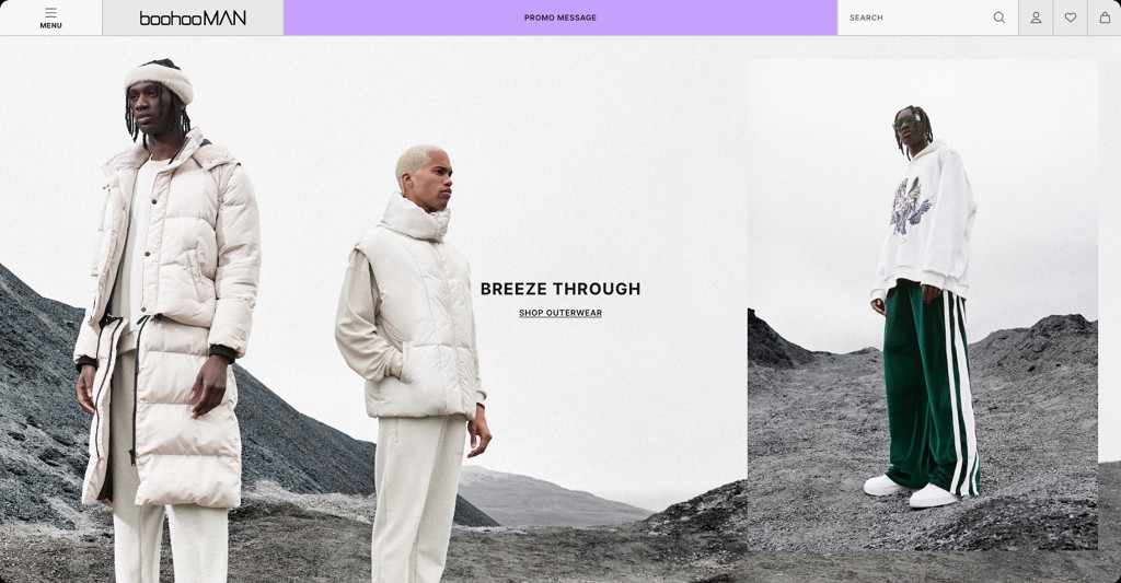
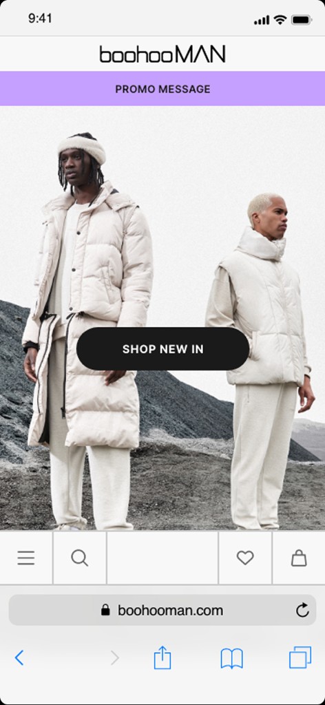
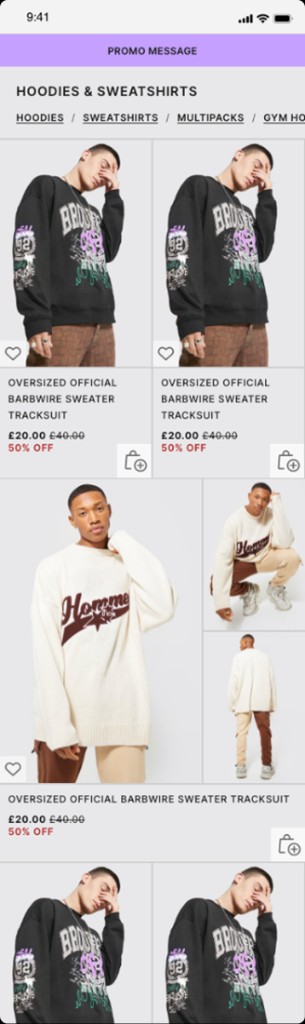
Helping lead a mobile-first redesign of a major fashion e-commerce experience, creating a more distinctive brand journey and rethinking how customers discover, explore and purchase products.
- Role
- UX Lead
- Focus
- E-commerce / UX Strategy / Product Discovery
- Product
- Fashion e-commerce
- Status
- Redesign not launched

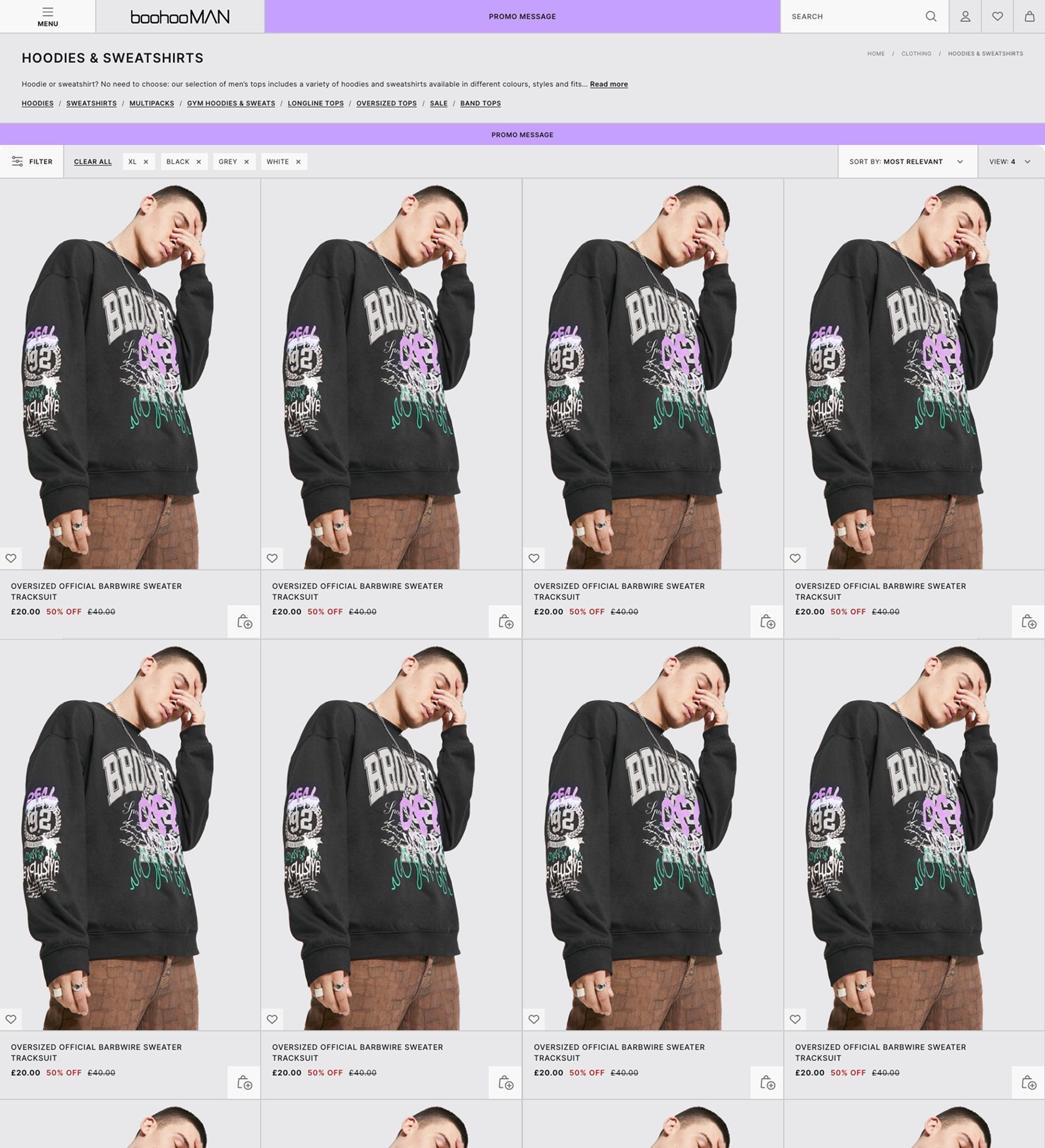

01 / The challenge
A big brand. A fragmented experience.
Over time, the BoohooMAN shopping experience had evolved through a series of incremental improvements and conversion-focused changes. While individual updates addressed specific problems, the overall experience had become increasingly fragmented.
The opportunity was to create a more cohesive and distinctive mobile-first shopping experience, without losing the speed, convenience and functionality customers expected from a major e-commerce platform.
02 / Discovery
Understanding the experience before redesigning it.
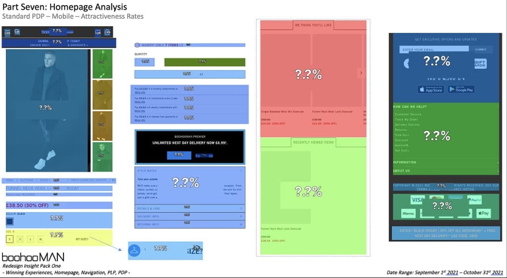
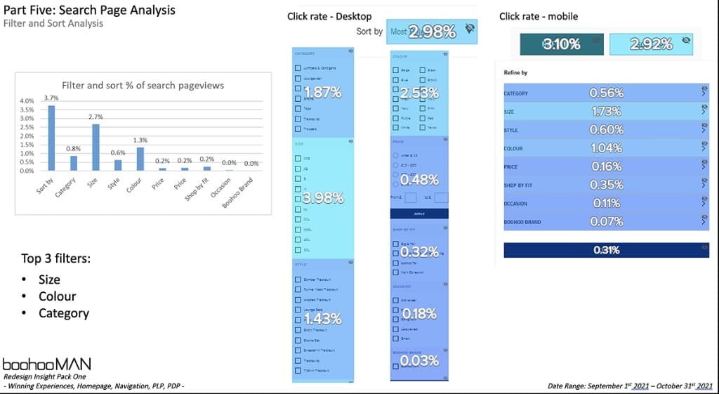
Before exploring solutions, I reviewed the existing customer journey using available analytics, stakeholder input and UX research. The aim was to understand which parts of the experience created friction and where improvements could make the greatest difference.
The findings helped establish priorities across browsing, product discovery and purchasing, while highlighting the need for a more consistent experience across different areas of the website.
01
Mobile-first behaviour
The redesign needed to prioritise how customers browse and shop on smaller screens, rather than adapting desktop patterns afterwards.02
Fragmented journeys
Years of incremental changes had created inconsistencies across related interactions, making the experience feel less cohesive.03
Discovery and purchasing friction
There were opportunities to simplify how customers find products, inspect key details and move towards purchase.
Mapping the shopping journey
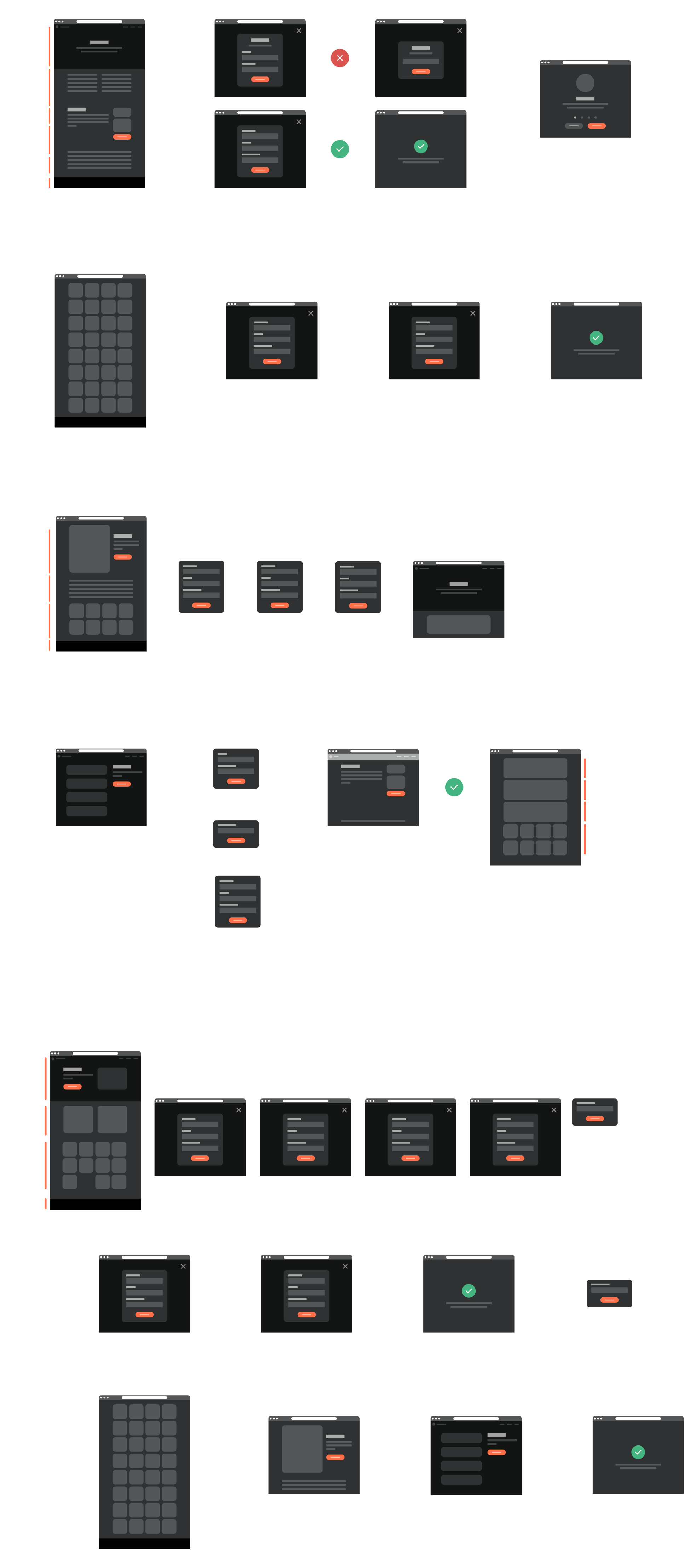
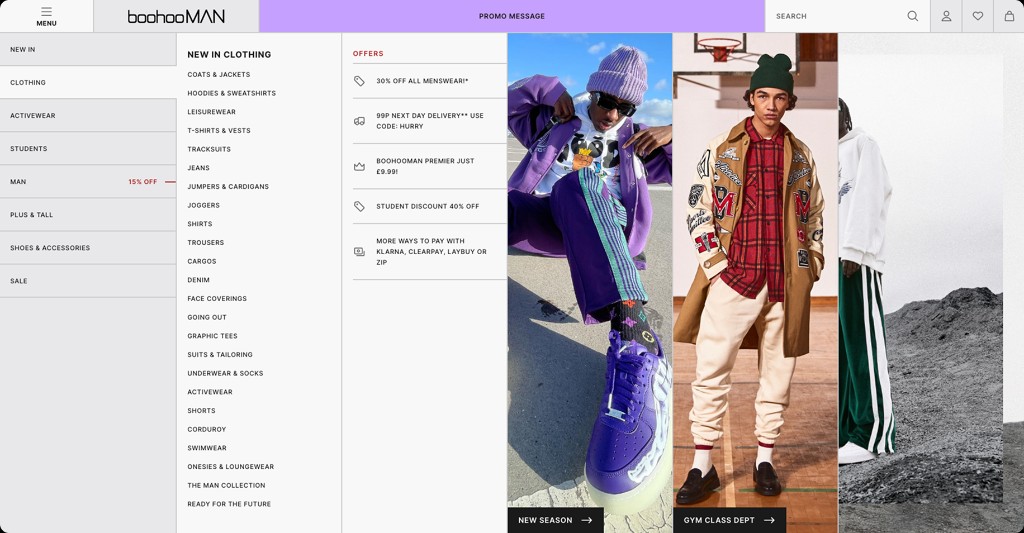
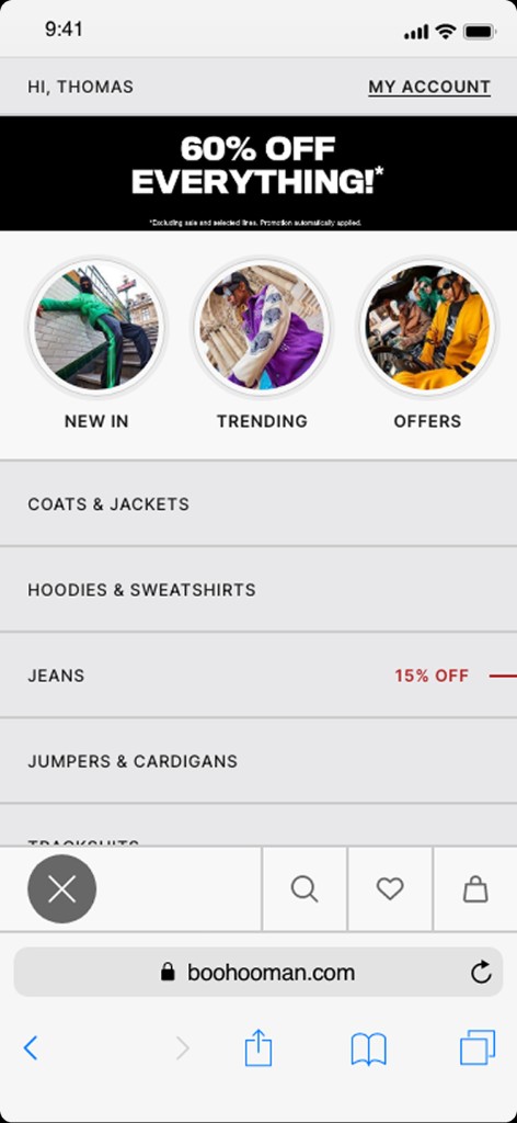
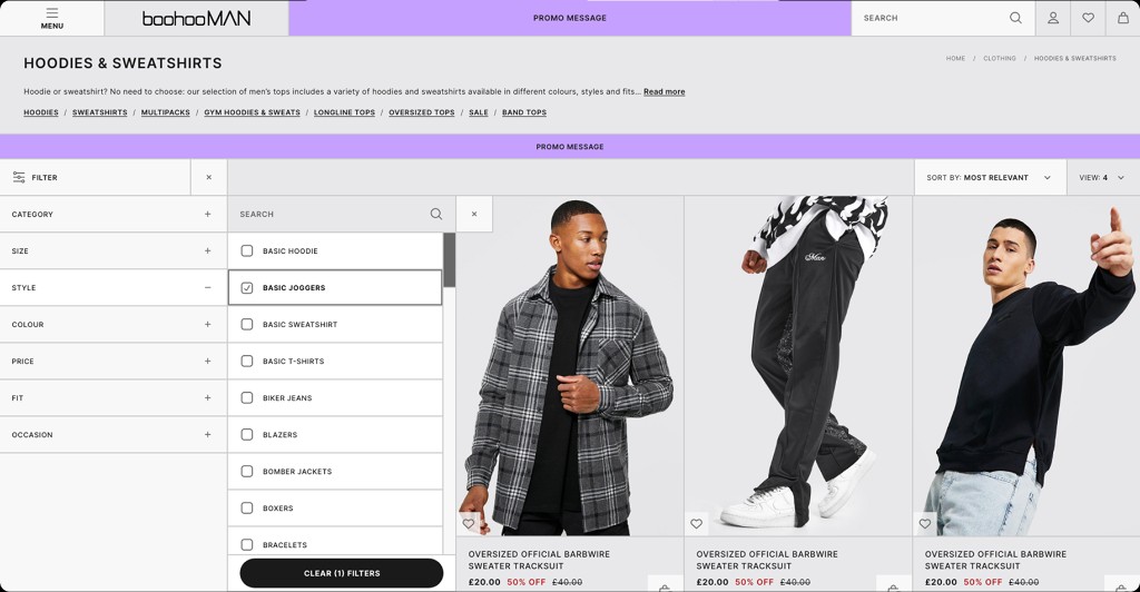
Before redesigning individual screens, I mapped how customers navigated the wider shopping experience, identifying how product discovery, filtering and account management connected.
This helped move us beyond the existing one-size-fits-all template and establish a clearer foundation for the areas I led across the redesign.
03 / The direction
One experience. A stronger identity.
The redesign aimed to create a more connected shopping experience that felt distinctly BoohooMAN. Rather than improving isolated screens, the focus was on establishing clearer patterns and a more coherent visual and interaction language across the customer journey.
I worked across the key shopping experiences, balancing customer needs, commercial priorities and feedback from different stakeholders.
01
Distinctive
Create an experience that feels recognisably BoohooMAN rather than another generic fashion storefront.02
Effortless
Make browsing, discovering and purchasing products more intuitive.03
Consistent
Bring related interactions together through repeatable design patterns.
04 / The experience
Rethinking the shopping journey.
01
Making it easier to find what's right.
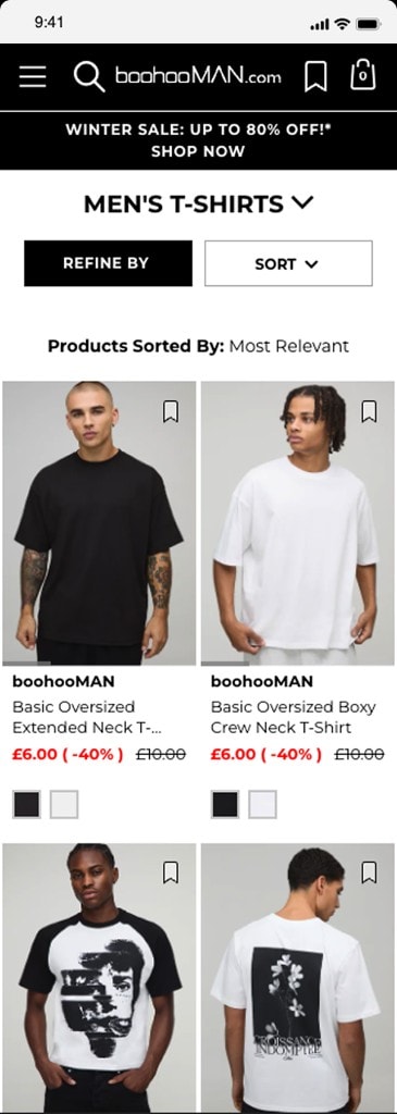
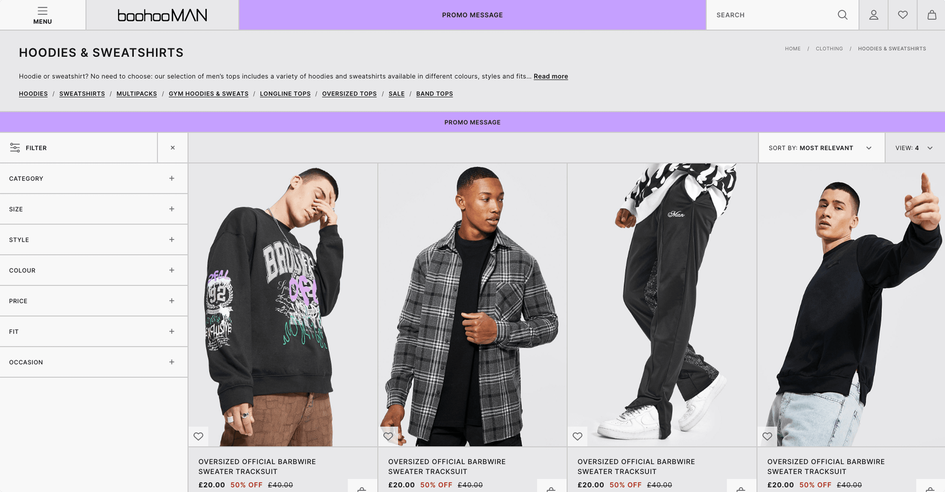
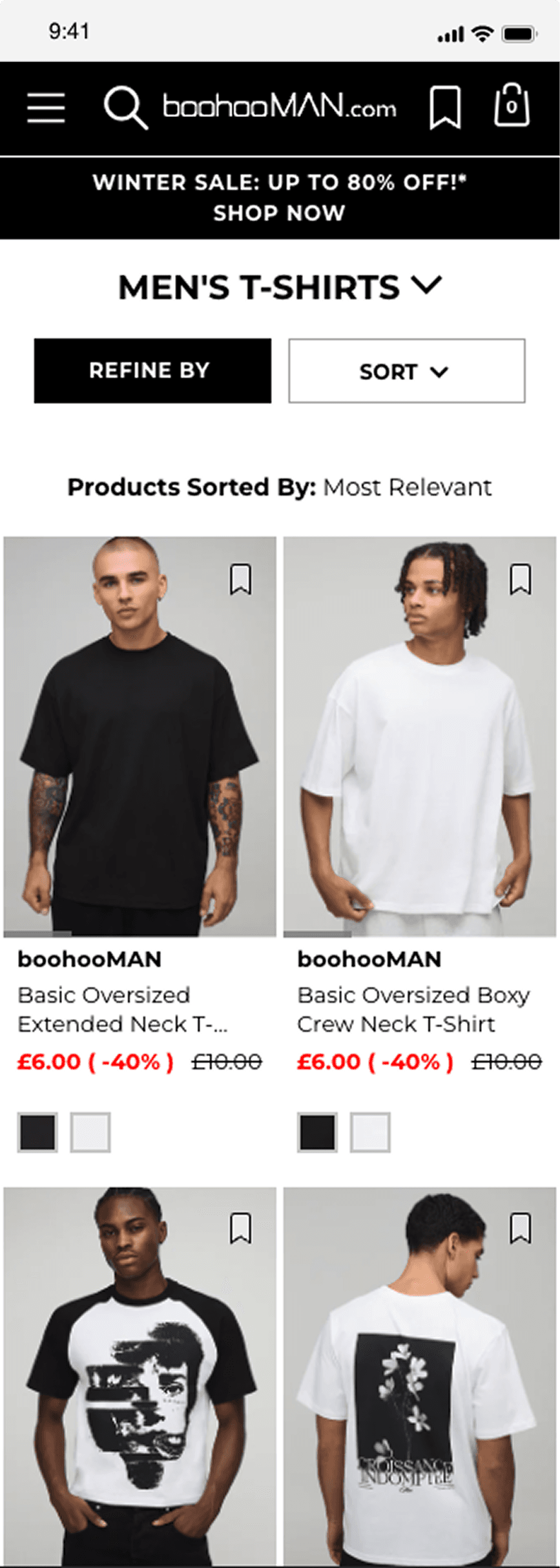
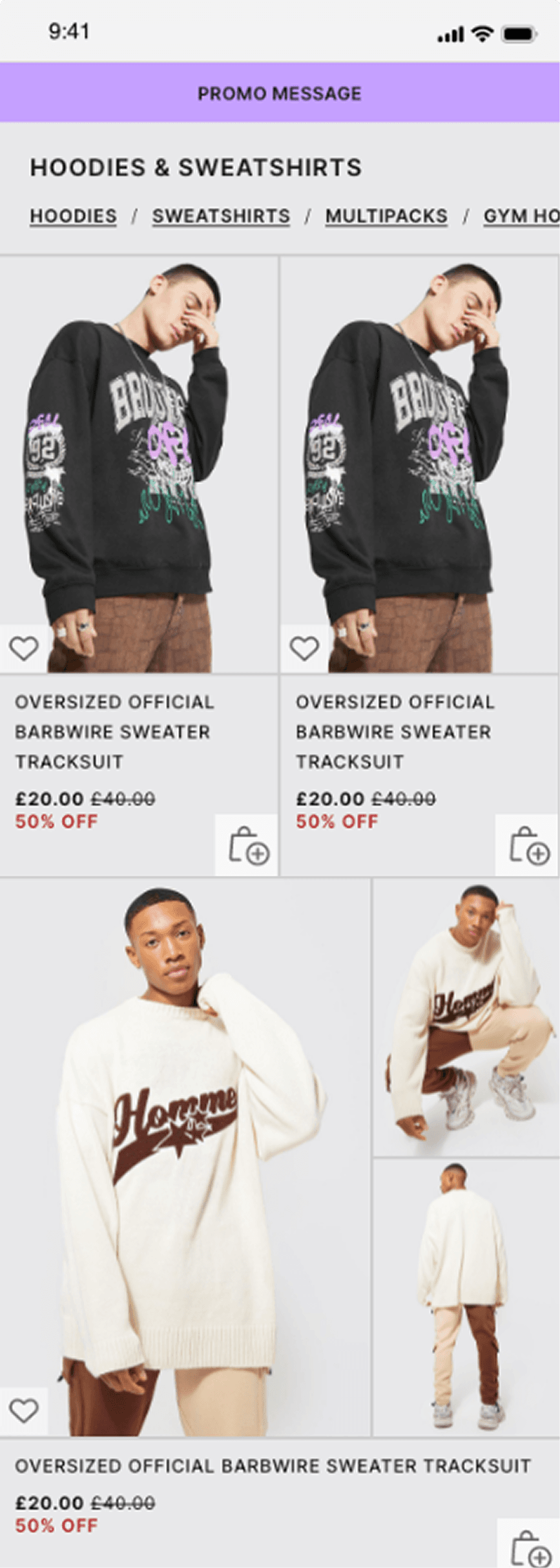
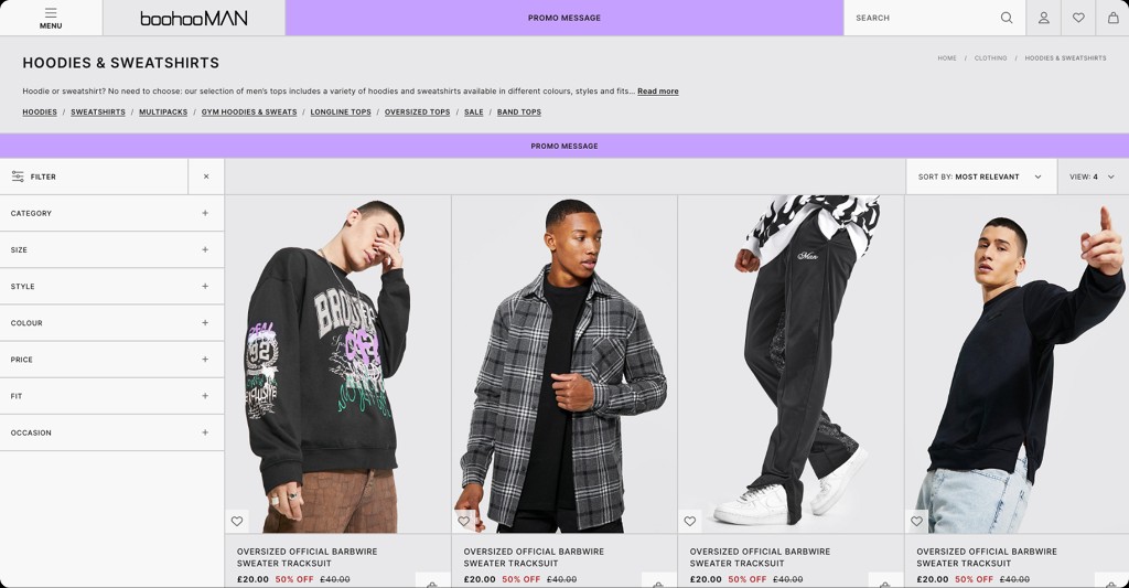
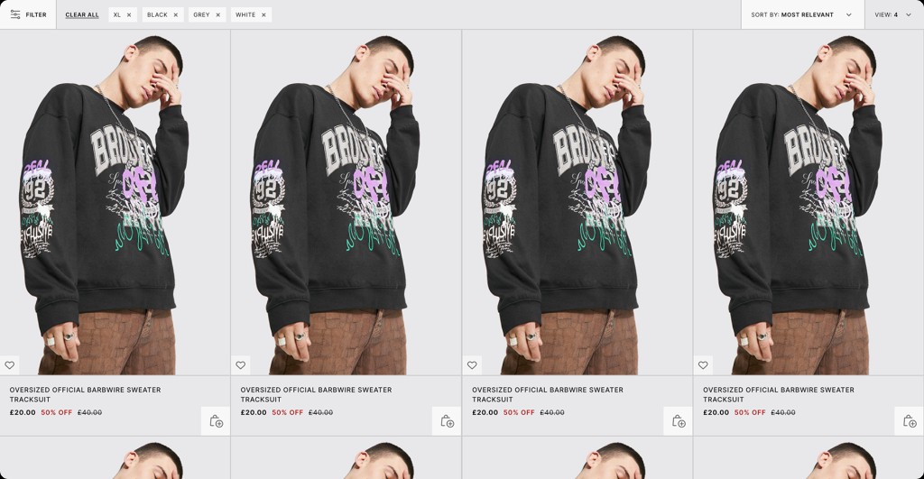
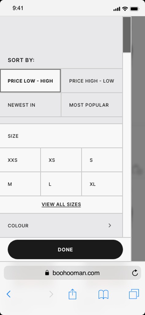
Product discovery is a critical part of the fashion shopping journey. I explored how the product listing experience could provide clearer information, stronger visual hierarchy and more intuitive ways to browse and compare products.
The aim was to help customers move naturally from exploration to consideration.
Better discovery, fewer unnecessary steps.
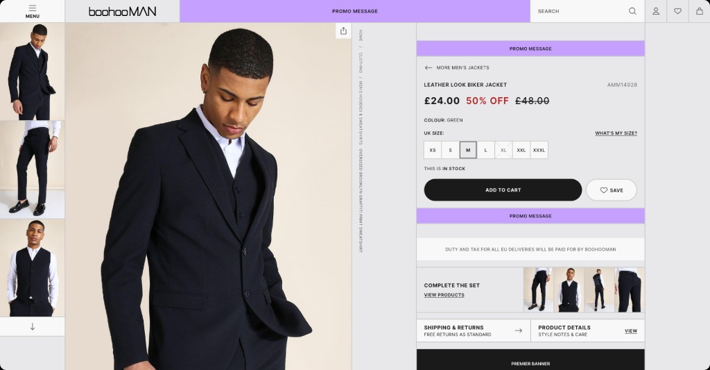
02
Less friction between finding and buying.
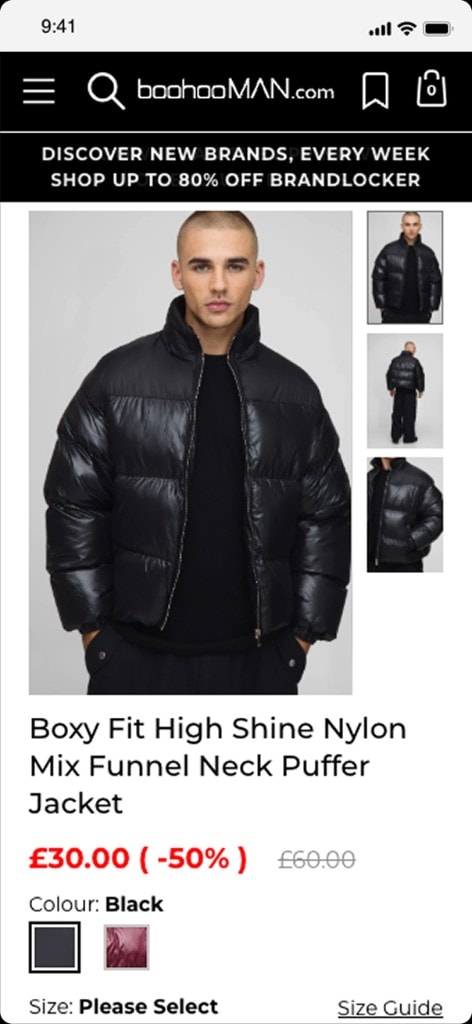
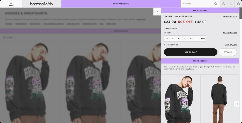
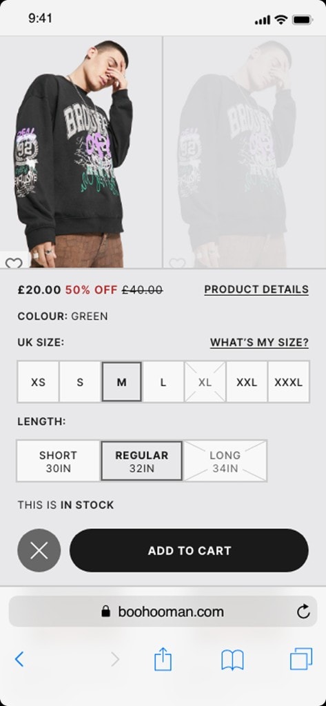
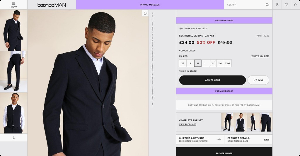
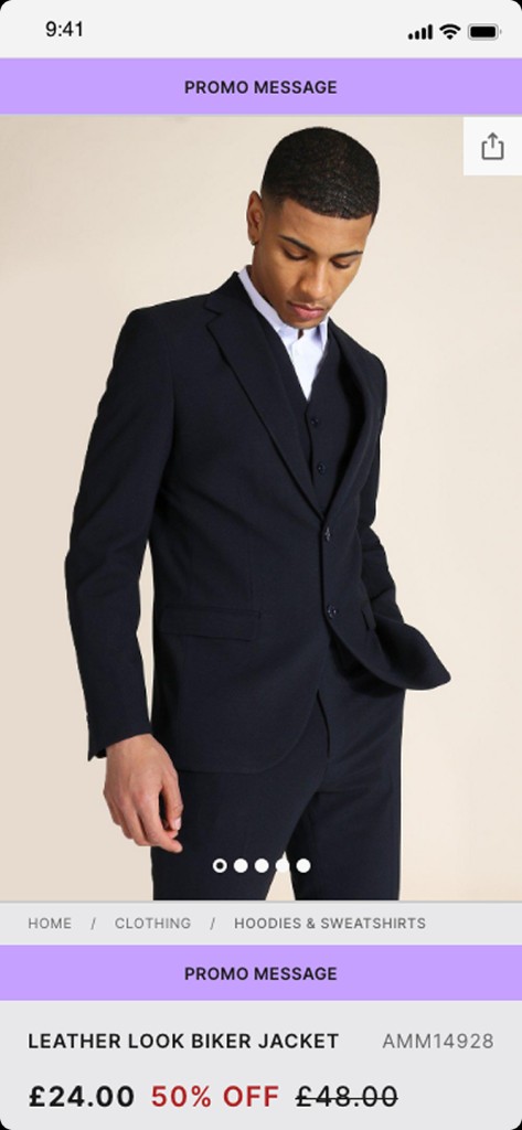
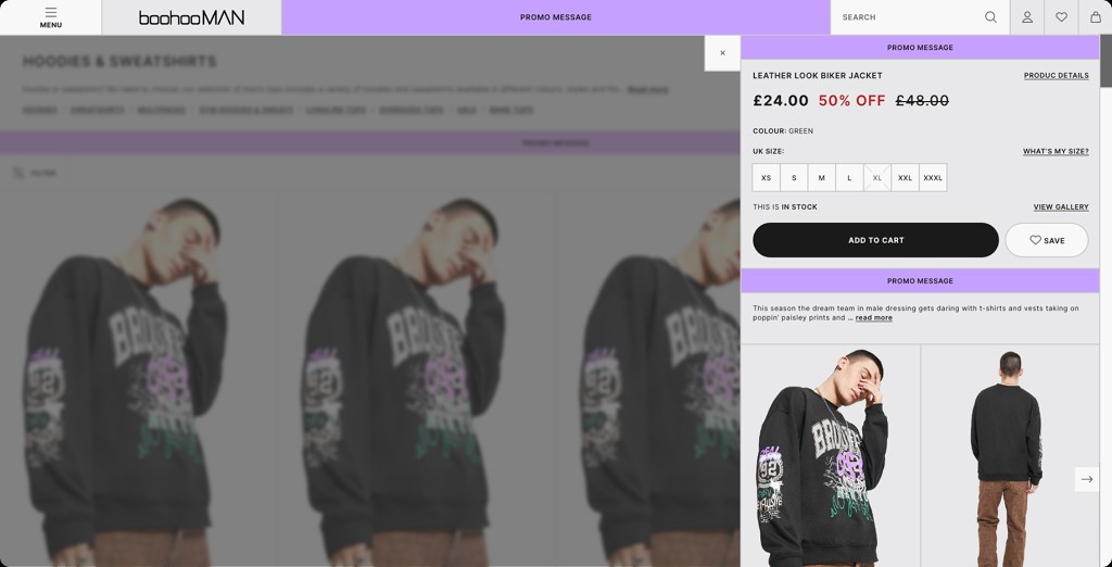
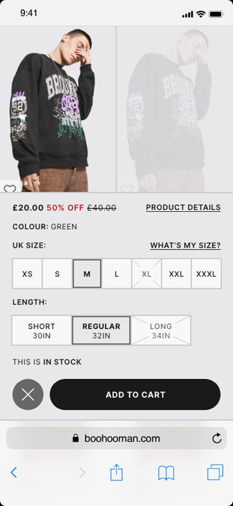
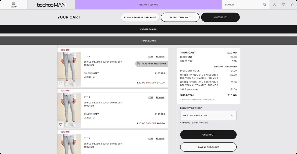
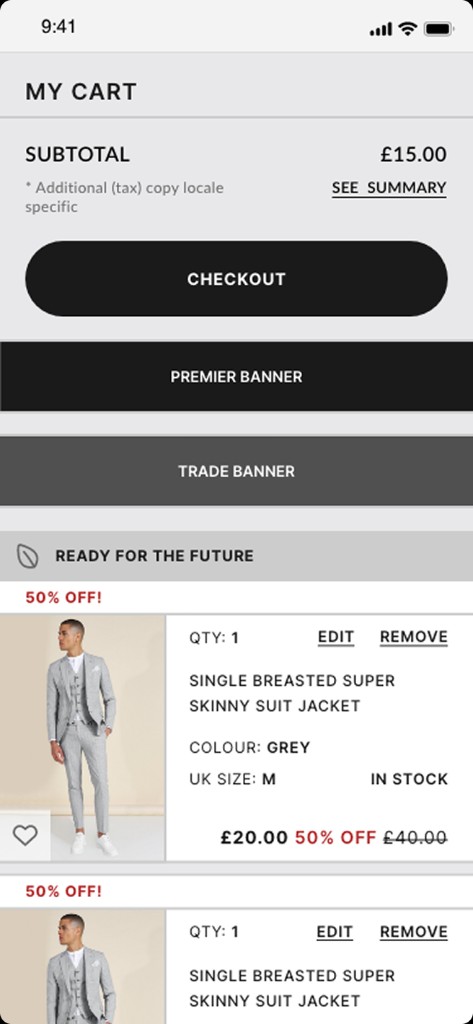
I explored how customers could access essential product information and make purchasing decisions without unnecessary navigation. Quick-buy interactions became an opportunity to simplify the journey from browsing to adding an item to the basket.
Keep customers in the shopping experience.
03
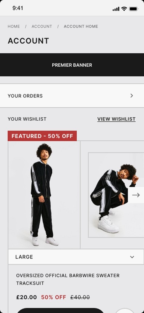
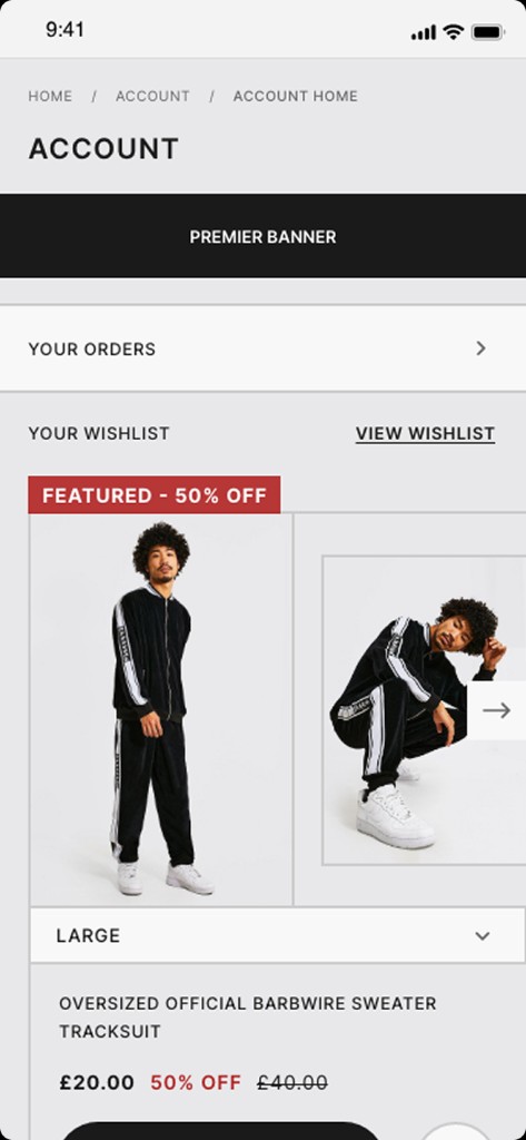
A more useful personal shopping experience.
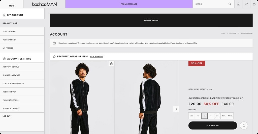
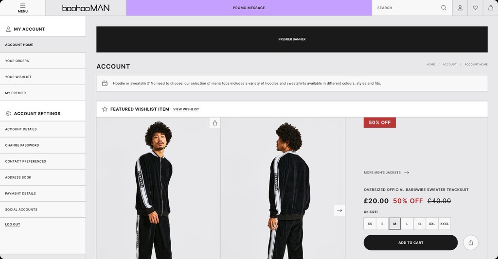
The redesign also explored how account-related journeys could become easier to navigate and more useful. I considered how customers access their details, revisit saved products and move between browsing and account management.
The goal was a more coherent experience, rather than treating these areas as separate parts of the website.
Make useful features feel connected.
04
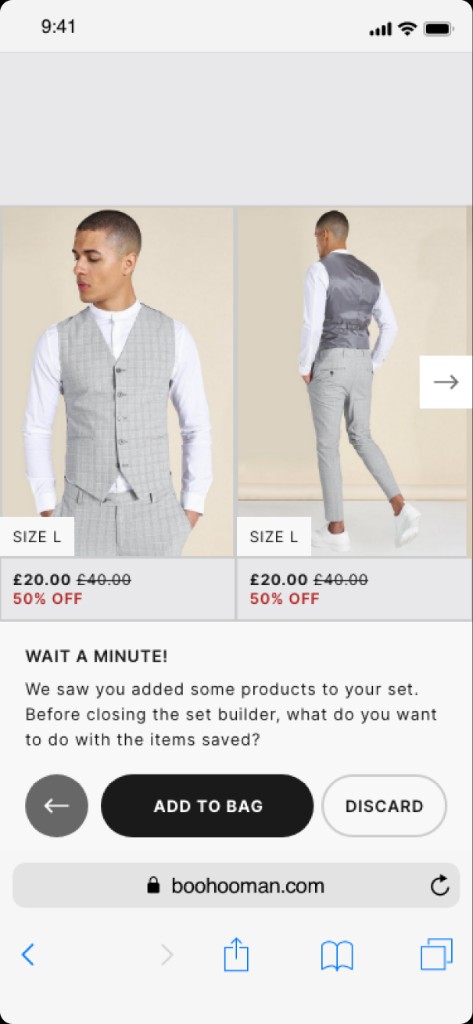
Making more of every shopping journey.
I explored opportunities to make product recommendations and additional discovery feel more relevant within the existing shopping experience. Rather than interrupting the customer, these interactions should support decisions they are already making.
Better relevance, not more noise.
05 / Collaboration
Getting everyone moving in the same direction.
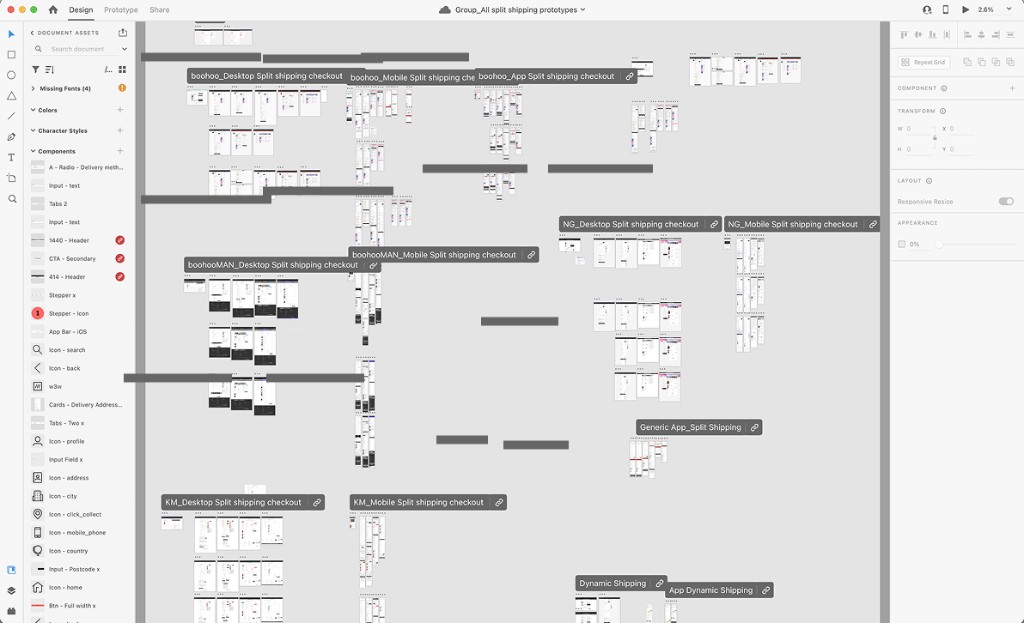
A redesign of this scale needed more than strong individual screens. It required coordinating feedback, aligning stakeholders and maintaining a consistent direction across different parts of the customer experience.
I helped lead the UX work by bringing research, design exploration and stakeholder feedback together, creating opportunities to review progress and address decisions before they became blockers.
01
Cross-functional collaboration
Working with stakeholders and other disciplines to understand requirements and align priorities.02
Regular design reviews
Twice-weekly progress updates and dedicated feedback sessions kept decisions visible before they became blockers.03
Consistency across journeys
Ensuring individual screens contributed to a coherent end-to-end experience.
06 / The outcome
A new direction. Not a launched product.
Full redesign not launched
The project established a more cohesive design direction across several core shopping journeys, bringing together research, stakeholder feedback and detailed UX exploration.
Although the full redesign was not launched, the work demonstrates how I approached a complex, multi-journey design challenge within a major e-commerce environment.
07 / Looking back
Good design needs more than good screens.
This project reinforced the importance of maintaining a clear design direction when working across multiple journeys and stakeholders. Individual improvements can be valuable, but the experience only becomes coherent when those decisions work together.
It also highlighted that strong design work doesn't always reach customers. The challenge is to make the research, decisions and collaboration valuable regardless of the eventual delivery outcome.